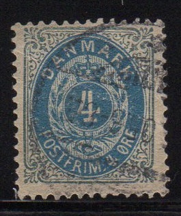
My collection of Denmark Definitives begins with the Bi-Color Numeral Issues from 1870 through 1904.
These stamps come in a number of challenging varieties, especially the “Inverted Frame” variety that exists on most of the stamps. This variety is poorly illustrated in all 3 of my catalogs (Scott, Michel and Facit)
The stamps come in 2 value types: “Skilling” and “Ore”. The Skilling (Equal to 1/96 of a Rigsdaler) as currency was in use until 1873, until the “New Krone” was introduced in 1875. 1Krone = 100 Ore.
Perforations
The stamps come in 3 perforation varieties. 14×13.5, 12.5, and 13. The 12.5 perforation is only available on the Skilling values 2s, 4s, and 48s.
Watermarks
There are 2 watermark types. Scott lists them as Watermark 112 and 113. They are very similar and sometimes difficult to tell the difference.
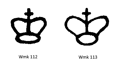
Looking at the second watermark image (Wmk 113) Note how sides of the crown extend upwards at much more of an angle than on Wmk 112. Also, on Wmk113 the bottom of the crown is less squished into an Oval than Wmk 112.
Frames
There are 2 frame types. The “Normal Frame” and the “Inverted Frame”. This was the most challenging as the Scott, Michel and Facit catalogs all have poor illustrations and descriptions of this variety. Fortunately I found a website that described the variety in more detail ( jaysmith.com )
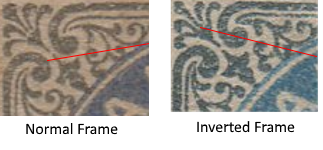
There are a couple of ways to tell the difference, but the easiest in my opinion is to examine the angle of the 2 buds on the branch above the “A” in “Danmark”. On the normal frame, see how the red line extends at an upwards angle, and on the “Inverted Frame” the line extends downward. In other words, on the Inverted Frame, the first “Bud” is higher than the second one.
Colors
Most of the issues exist in a variety of colors and shades. Some of these color varieties are given minor number status by all 3 catalogs.
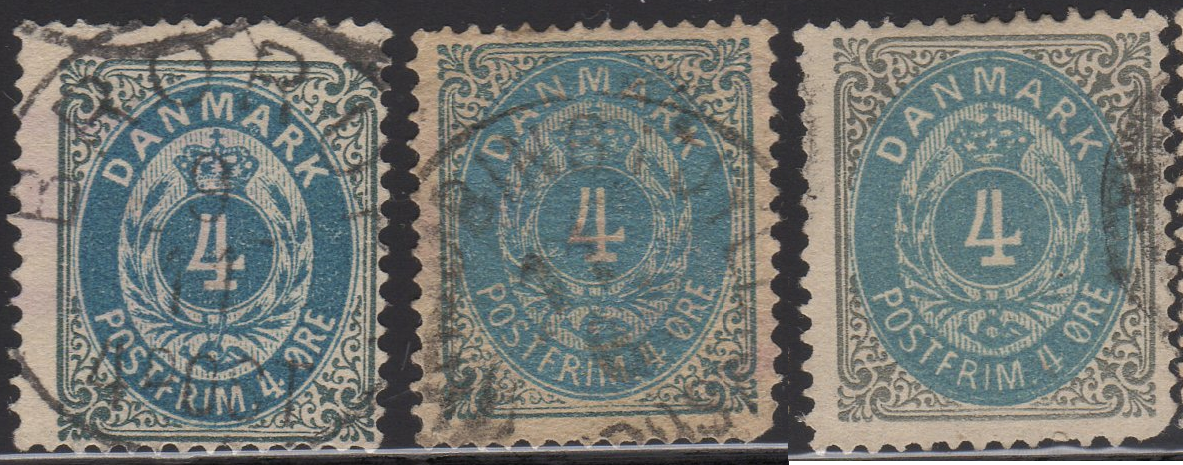
Note both the color differences in the Blue as well as the background. Background is more greenish slate in some than others.
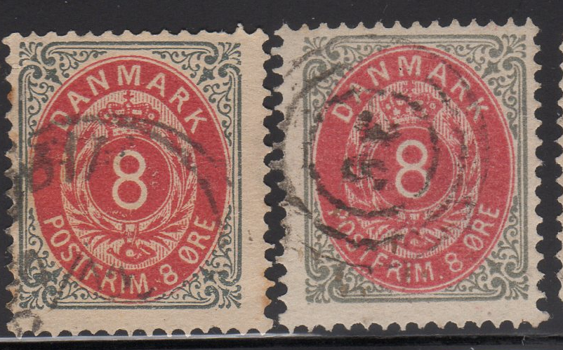
Background and foreground color differences.
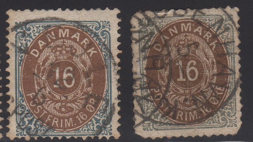
Note the brighter blue in the first stamp.
My collection only contains a few examples of the 4o, 8o, and 16o in various varieties, but many of them are in rough shape. I kept them in order to note the color differences among them.
Hi Eric,
I read your updates on Stampboards and am avidly watching your collection grow. I’m finally taking time to catalogue and consolidate my worldwide collection. I keep everything, but tend to focus on pre-1970 stamps.
My question: how do you lay things out in your album? I know you use Vario pages; have you ever share a scan of a page with lots of varieties like these Danish numerals?
I ask because it’s time to do justice to my Sweden collection, and I got drawn into all those Facit AB and BA booklet pairs. 🙂
Keep up the great work!
Mark (from just north of you in Saskatchewan.)
Thanks Mark – Yes, I seem to find some satisfaction in my total number increasing.
I generally lay things out usually in Scott or year order, but many times take a different approach. With the Denmark Definitives, I grouped them all together at the front of my Denmark collection.
I also keep all color varieties, shades, perfins, etc. that I find and place them usually right in line. Sometimes it looks like a mess, other times, looks pretty good.
Here is an example of a page:
Thanks for reading my blog! – I mainly am just writing to document my own collection…since, when do I ever open up my albums just to look at the stamps? – rarely it seems.
Thanks for the scan. I do a very similar thing for Scandianvian countries where I tend to specialize. Definitives in front, commems, etc after that.
I do love me a long set like Norwegian posthorns or Danish wavy lines. 🙂
Mark
I agree….Definitives never get enough love! They are sometimes more interesting the commem’s. The long running ones usually have many color shades and other varieties that you just don’t get with commemoritive stamp issues.
Hmm… I wonder if we’re seeing (a beginning of ) a trend with this one.
-k-
Us stockpage/book users have it figured out really. Printed Album Pages? – No thanks! (caveat – My Free Albania Committee stamps are on pages because it is sort of a specialty collection)
Try to see the illustration on pg. 4 left side. Here you Can see what we looking for in Denmark, when looking for normal, and inverted frame.
http://tofarvet.dk/gor%20det%20selv/Intro%20til%20Tofarvet.pdf
Thanks for the site.
Normally we work with 3 value type, the last one is cent. Issue for danish West indies.
Thanks for the link. Great information!
Hello,
I was glad to read this post about these Danish stamps in particular. I came upon a couple thousand of them and didn’t know anything about them. Your post helped me figure out what they were called and a bit of information on them. I took lots of pictures of my bundles. https://www.margaretemiller.com/postage-stamp-bundles/ Hope you find them interesting.